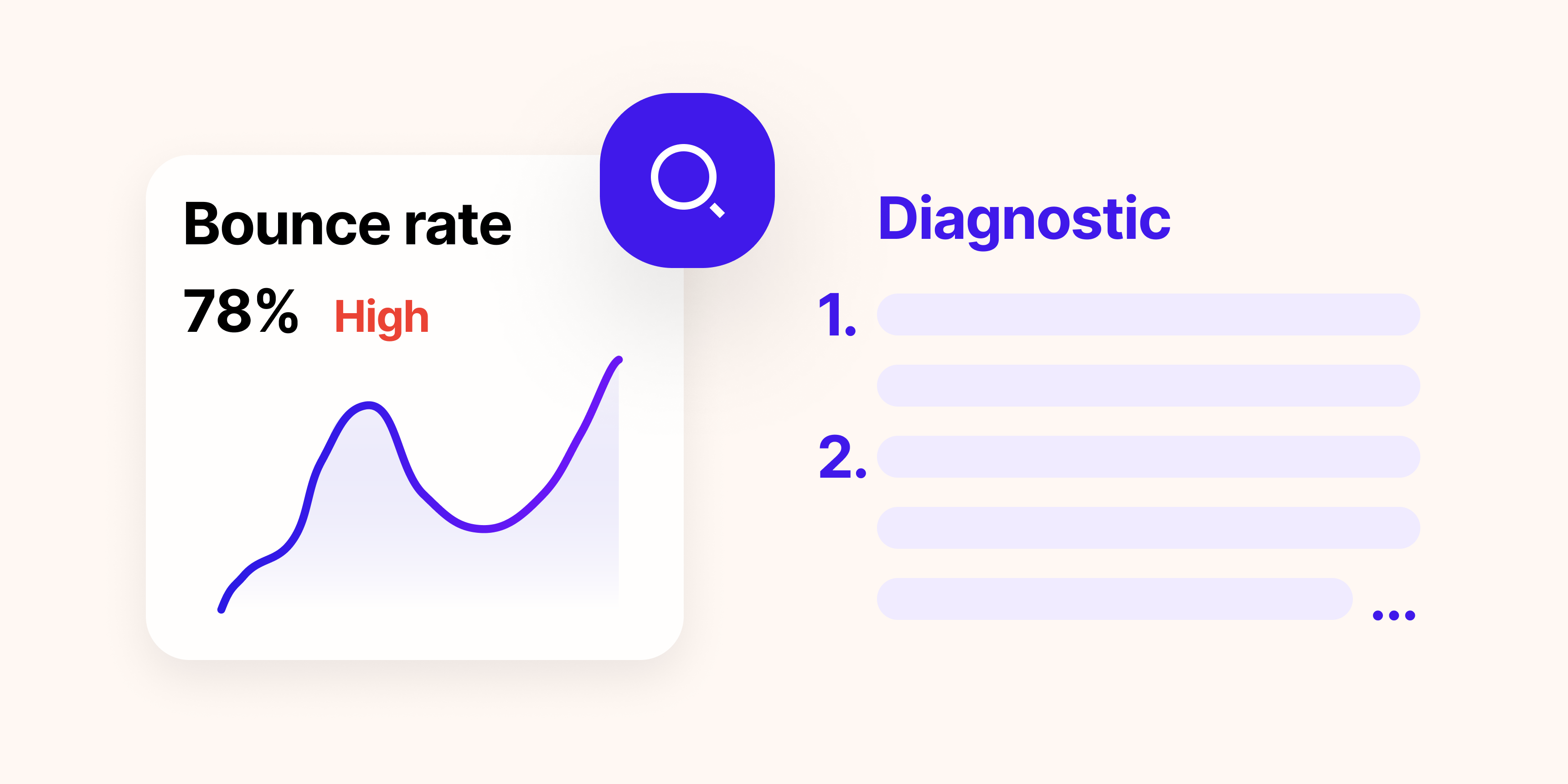
Installing a heatmap tool takes about ten minutes. Actually using what it shows you takes longer, because most people don't know what they're looking for. The common pattern: open the heatmap, spend a few minutes looking at the colors, notice that the button gets a lot of clicks, close the tab. Nothing changes.
The problem isn't the heatmap. It's that a heatmap is not self-explanatory. It's a diagnostic instrument, and like any diagnostic instrument, it requires knowing what patterns indicate a problem versus what's expected behavior. An aggregate of clicks is noise. A cluster of clicks in the wrong place is a signal.
This guide covers five patterns that consistently appear in heatmaps when something is broken on a page. Not what a heatmap is; that's the glossary. What it's telling you, and what to do about it.
A quick note on heatmap types
Before the patterns: heatmaps come in three forms, and they answer different questions.
- Click maps show where users click (or tap on mobile). They reveal what people interact with, what they try to interact with, and what they ignore.
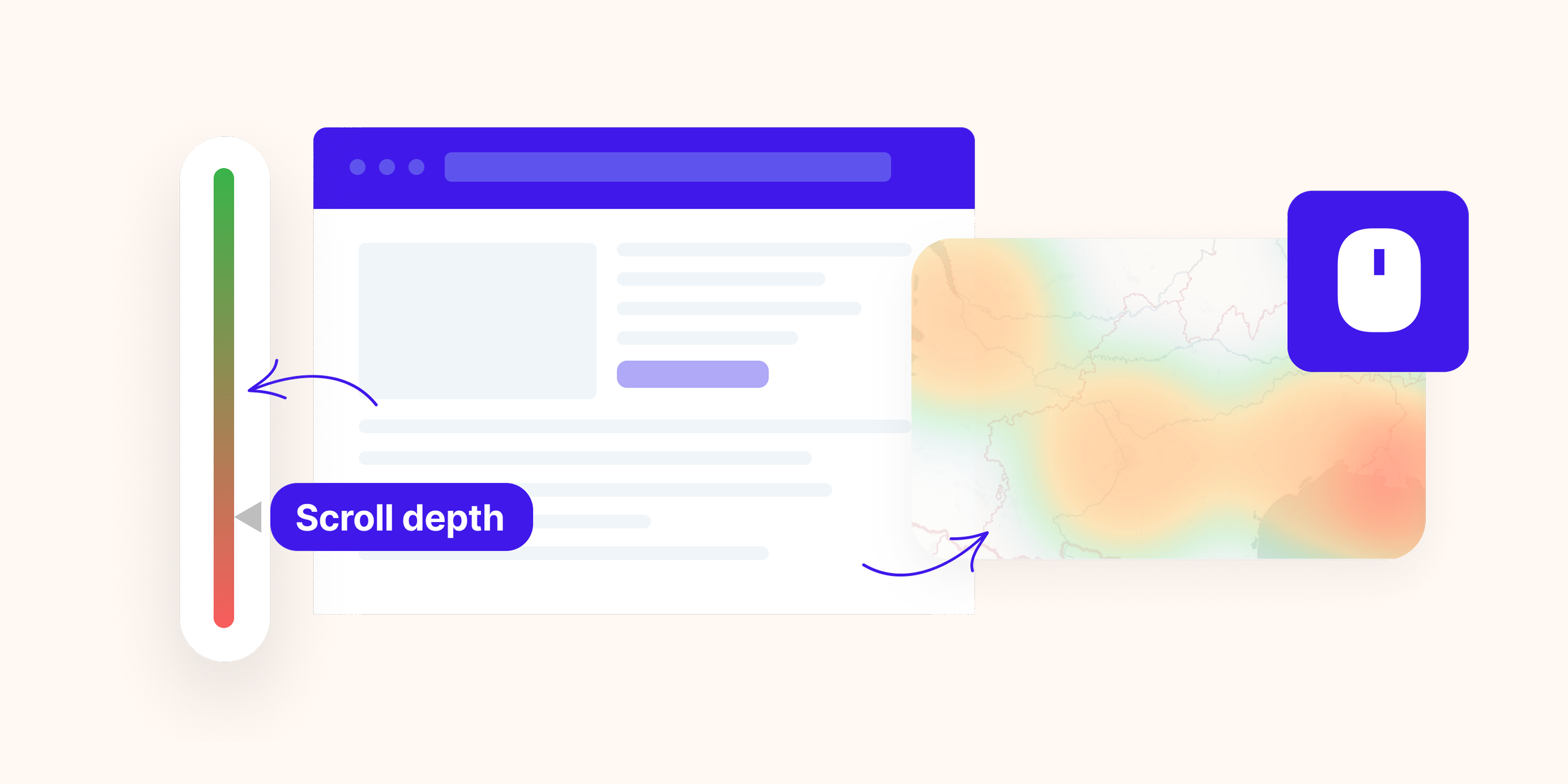
- Scroll maps show how far down the page users scroll before leaving. They reveal whether users are reaching your key content and conversion elements.
- Move maps track where users move their mouse (desktop only). They are a rough proxy for where attention goes, though less reliable than the other two types.
Most of the five patterns below come from click maps and scroll maps. Move maps are useful for qualitative exploration but shouldn't drive conclusions on their own.
Pattern 1: The scroll cliff before your CTA
Open your scroll map. Find your primary call to action: the button or form that drives your main conversion. Now look at what percentage of users is scrolling far enough to see it.
If scroll depth drops sharply at 40–60% and your CTA sits at 70%, users are not reaching it. This is one of the most common and most fixable problems in conversion optimization, and it is invisible without scroll data.
What causes the cliff matters. Look at what content sits just before the drop-off point:
- A long block of dense text that loses momentum
- A section that looks like a footer or an ending (low visual weight, light background, summary language)
- A competing element that answers the user's question early, removing the reason to keep scrolling
The fix is rarely "move the CTA higher," though sometimes that's right. More often it's restructuring the section just before the cliff: shorter paragraphs, a visual break, a directional cue that signals there's more worth seeing.
One useful benchmark: on a standard product or landing page, your primary CTA should be visible to at least 60% of visitors. If you're below that, the scroll cliff is costing you conversions you can't see in your conversion rate data because users never reached the decision point.
Pattern 2: Clicks on elements that aren't clickable
Look at your click map. Find the clusters. Now check whether those clusters are on interactive elements (buttons, links, form fields) or on something that has no interaction: a product image, a headline, a stat, a logo, a feature icon.
Clicks on non-interactive elements are a specific signal: users expected something to happen, and it didn't. This is called a frustrated click or a rage click, and it indicates a broken expectation rather than a broken element. The element is working exactly as designed; the design is just wrong.
Common versions of this pattern:
- Product images that users try to zoom or enlarge
- Feature names or headings that users click expecting an expand or modal
- Statistics or numbers that look like they link to a source
- Underlined text that's styling, not a link
- Card components that look fully clickable but only have a small "Read more" link
The fix is either to make the element interactive (add the zoom, add the link, make the whole card clickable) or to redesign it so the expectation isn't created. The second option is often better. Adding functionality to satisfy a confused expectation rarely solves the underlying clarity problem.
Pattern 3: A dead zone above the fold
This pattern is the opposite of what most people expect: low engagement at the top of the page, despite the fact that every user sees it.
On a click map, it shows up as near-zero clicks in the hero section, with no interaction with the headline, the subheadline, or the surrounding visual. On a scroll map, it shows as users jumping past the top quickly without pausing.
What this means: your above-the-fold content is not communicating value fast enough. Users are scanning, not reading. They arrive with a question ("is this relevant to me?") and your hero section is not answering it clearly enough to earn their attention.
This is different from a high bounce rate, which tells you users left. A dead zone with low bounce means users stayed but skipped your most important content. They continued scrolling in search of something that answered their question, which means the conversion work is being done further down the page, with less context and less intent.
The common causes:
- A headline that describes what you do rather than what the user gets
- A hero image or animation that draws the eye away from the copy
- A value proposition buried below a navigation bar and a large visual element
- Misalignment between the ad or link that drove traffic and what the page opens with
Test headline clarity before anything else. The visual can be fixed later. If users are not engaging with the words, redesigning the layout around the same words will not solve the problem.
Pattern 4: The device gap
Never read a heatmap in aggregate if you have meaningful mobile traffic. An aggregate heatmap on a page with 60% mobile visitors is dominated by mobile behavior, and the two audiences are using a fundamentally different version of your page.
The device gap pattern appears when you compare the scroll map or click map across devices and find significant divergence: desktop users scroll to 70%, mobile users stop at 35%. Desktop users click the primary CTA, mobile users click a secondary navigation link instead.
When this gap is large, it usually points to a layout problem specific to one device:
- A full-width image on mobile that pushes all content below the fold
- A CTA button sized for desktop that's too small to tap on mobile
- A two-column feature section that stacks into an unreadable vertical list on small screens
- Font sizes that are comfortable on desktop and require zooming on mobile
The fix requires auditing the mobile experience specifically, not assuming that a responsive layout is a good mobile experience. Responsive means it adapts. It doesn't mean it works.
Segment your heatmap by device before drawing any conclusions about the page. A "good" aggregate can mask a broken mobile experience affecting the majority of your visitors.
Pattern 5: The distraction cluster
This is the pattern that catches most teams off guard because it looks like engagement. High click volume on an element feels positive, until you check where those clicks are going.
A distraction cluster is a concentration of clicks on an element that pulls users away from your conversion flow: a navigation link on a landing page, a "learn more" link to a blog post in the middle of a product page, a logo that takes users back to the homepage, a footer link that leads to an unrelated section.
The clearest version: a landing page built for a specific campaign, with a full site navigation still visible. The heatmap shows the highest click density on the nav links, not the CTA. Users are leaving through a door you forgot to close.
What to look for: on any page with a single intended action, find the elements getting the most clicks and check whether those clicks serve your goal or redirect away from it. On dedicated landing pages, the answer is almost always to remove or hide the navigation. On product pages and content pages, the question is whether the competing content is pulling intent-heavy users or low-intent browsers, and whether the tradeoff is worth making.
What to do after you spot a pattern
A heatmap tells you where the problem is on the page. It doesn't tell you why it's happening. That's the job of session recordings.
If you find a scroll cliff at 55% and your CTA is at 70%, the next step is to filter session recordings to users who stopped scrolling in that range and watch what happened in the seconds before they left. Did they read the section and close? Did they hesitate on one element? Did the page load something at that point that interrupted them? The heatmap gives you the coordinate; the recording gives you the story.
This two-step diagnostic, heatmap to find the location and recording to understand the behavior, is consistently faster at identifying root causes than either tool alone. The same logic applies when you filter session recordings by traffic source: the segment defines the question, the recording answers it.
The limit of aggregate heatmaps
Beyond device segmentation, the most underused dimension for heatmap analysis is traffic source.
A user arriving from a branded search (someone who typed your company name) brings a completely different level of intent than a user arriving from a display ad retargeting campaign. They will interact with the same page differently: different scroll depth, different click patterns, different tolerance for content length.
An aggregate heatmap averages these two audiences together. If your high-intent organic visitors scroll to 80% and your low-intent paid visitors scroll to 30%, the average is 55%, which makes the page look mediocre when it might actually be working well for the audience it was designed for.
Segment your heatmaps by traffic source before deciding whether you have a page problem or an audience targeting problem. The distinction changes the fix entirely: one is a design problem, the other is a media spend problem.
Turning patterns into measurable tests
A heatmap pattern is a hypothesis, not a diagnosis. "Users aren't scrolling to the CTA" is not a finding; it becomes one when you make a change and measure the effect.
Before making changes based on heatmap patterns, set a baseline metric you can track:
- If fixing a scroll cliff: set a scroll depth goal for the percentage of users reaching the CTA section
- If fixing a dead zone: track time-on-page or hero section engagement as a leading indicator
- If fixing a distraction cluster: track the click rate on your primary CTA specifically, not just overall conversion
Without a baseline, you make a change, reopen the heatmap a month later, and have no way to know whether what you're seeing is better, worse, or just different. A measurable goal before the change turns heatmap analysis into a real optimization loop rather than a series of aesthetic adjustments.
The bottom line
The five patterns (scroll cliff, phantom clicks, dead zone, device gap, distraction cluster) cover the majority of meaningful heatmap findings. Most pages that have conversion problems show at least one of them clearly. Most teams that look at their heatmaps don't know to look for them.
The sequence that works: open the scroll map first, find where users stop. Open the click map second, find what users interact with and whether that interaction serves the goal. Segment by device. Segment by traffic source. Then go watch the session recordings for the segments that show the problem.
Data tells you something is wrong. Observation tells you why.