
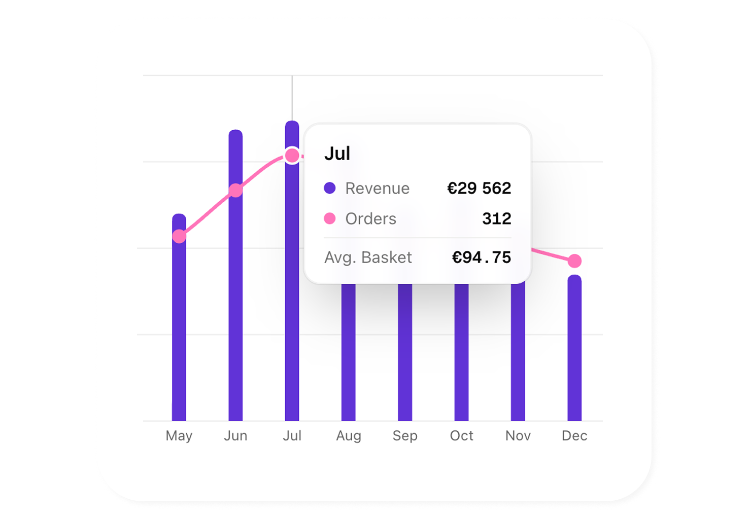
Clear visualizations for every metric
Trend lines, comparative bars, pie charts, geographic maps and heatmaps — each data type is displayed with the most suitable chart. Hover for details, zoom into a period, click to filter.
- Lines, bars, pies, areas — automatic or manual chart selection
- Interactive map with geographic data by country and city
- Breakdown by source, device, page and acquisition channel
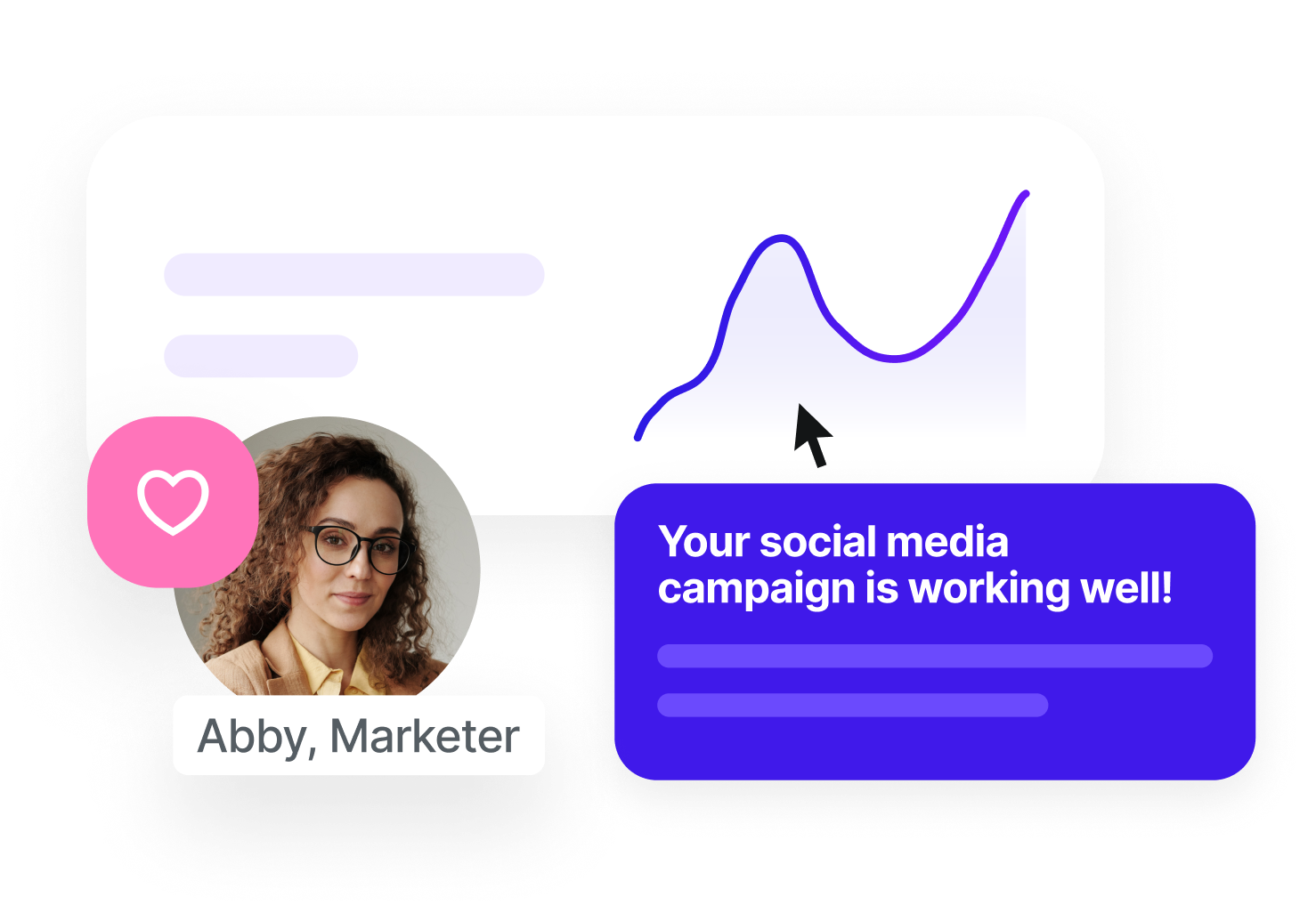
An interface your teams love to use
Sublim is designed for marketers, not data analysts. Each dashboard is clean, immediately readable, and built for fast decisions. And when data doesn't speak for itself, AI steps in and explains what you need to take away.
- Intuitive interface, zero learning curve for your team
- AI highlights key trends, anomalies and opportunities
- Automatic summary of each dashboard in plain language
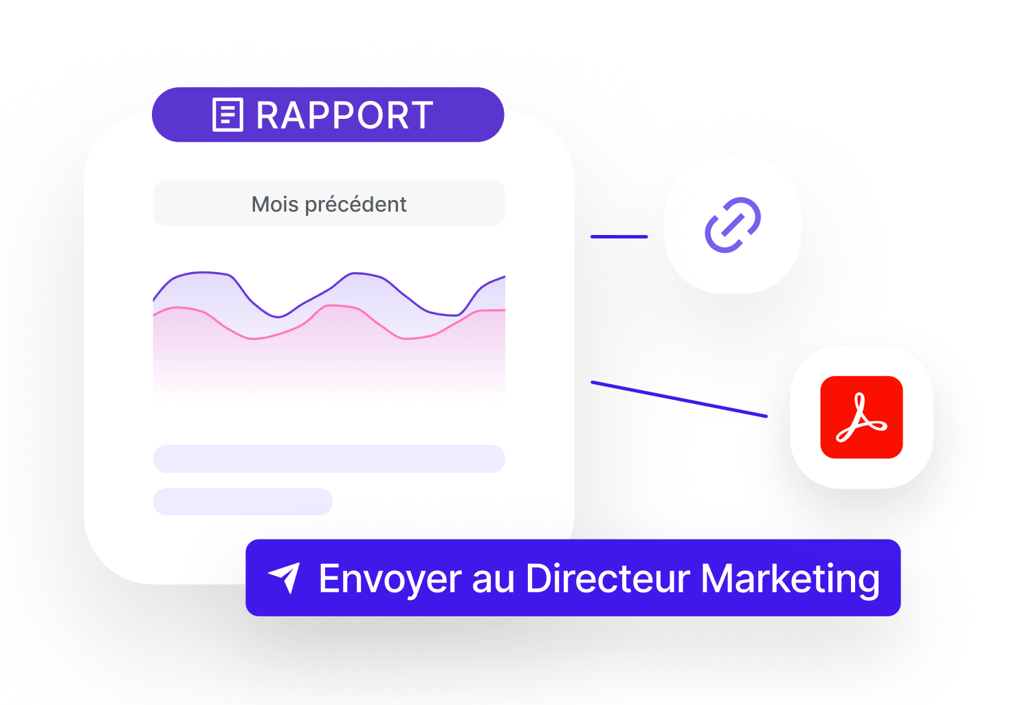
From report to recipient in just a few clicks
Generate a PDF report with an AI-written executive summary, schedule automatic delivery, or share a live link to your dashboards. Your team and clients access the same data, always up to date, without needing an account.
- PDF export with AI-written executive summary
- Scheduled automatic delivery: weekly, monthly or custom frequency
- Read-only sharing link, data synchronized in real time
See a Sublim analytics report
Download a real AI-generated analytics PDF report.
Charts, KPIs and executive summary: see exactly what your teams receive.
Visuals tailored to your role
CMO, traffic manager, project manager or consultant — explore live or export to share according to your workflow.
Marketing Manager / CMO
Get a summary dashboard with your key KPIs and export it as a single slide for your board meeting. AI comments on the results for you.
View solution
Traffic Manager / Growth
Visualize each acquisition channel's performance at a glance. Compare curves, spot trends and share charts in one click.
View solution
Digital Project Manager
Create custom dashboards per project and share them with the relevant teams. Everyone sees the same data, in real time.
View solution
Consultant / Freelancer
Generate branded visual client reports automatically every month. PDF or PowerPoint, scheduled and sent without intervention.
View solution
Frequently asked questions about Sublim visualization
What types of charts are available in Sublim?
+
Sublim offers trend lines, bar charts, pie charts, area charts, interactive geographic maps and heatmaps. The chart type is automatically chosen based on the data, but you can change it manually.
Can I export my charts and reports?
+
Yes. You can export to PDF or Excel. Reports include your KPIs, charts and AI commentary. The number of reports depends on your plan (1/month on Starter, 5 on Pro, 10 on Growth, unlimited on Business).
Does the AI really write the report commentary?
+
Yes. When you generate a report, AI analyzes the included data and writes contextual comments: identified trends, points of attention, comparisons with the previous period. You can edit them before export.
Can I schedule automatic report delivery?
+
Yes, starting from the Pro plan. You choose the frequency (weekly, monthly or custom), the recipients and the format. Reports are generated and sent automatically with the most recent data.
Are the dashboards customizable?
+
The main dashboard is pre-configured with essential KPIs to be useful from day one. You can apply filters, change periods and choose the displayed metrics. Advanced customization (widgets, layout) is planned in the roadmap.
Can I share a dashboard with someone who doesn't have a Sublim account?
+
Exported reports (PDF, shareable link) can be shared with anyone. Live dashboard sharing is reserved for workspace members to ensure data security.